Hi everyone,
This week I’ll be talking about Flame Over’s art style. When I first dreamt up the idea of a fire fighting Roguelike I saw it as a top-down 2D game, in the tradition of Rogue, Nethack, etc , albeit with more bells and whistles, because– let’s face it – RLs aren’t famed for being the prettiest games. ;)
Paul, one of our artists responsible for the look of Ace Armstrong and the Alien Scumbags and Orbit, (both PSP minis) came up with a target image for a 2D game. Paul has a really dynamic cartoon style, which would be helpful in making a fire fighting Roguelike feel like a fun game and not the harrowing experience a fire fighting game potentially could be.
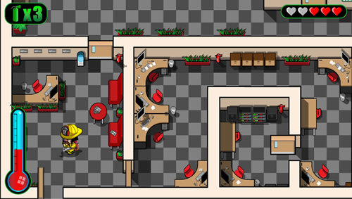
Above: A very early concept image, showing relative scales of walls, fuel items and player character. We soon decided to make the jump to 3D.
Once we’d decided on a top down 2D perspective Paul did some quick test images showing how we’d present our world (see above.) There are lots of problems with forced perspective in 2D games as you want to minimise the thickness of walls as much as possible (otherwise you end up with just as much wall in your level area as you do interactive areas.
After much to-ing and fro-ing we decided on a U-turn. We would create the game in 3D instead! That was a BIG decision as we’ve never worked on an entirely 3D game before (Vibes and the Fighting Fantasy minis did have a few 3D elements.)
Once we settled on 3D there was no turning back!
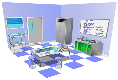
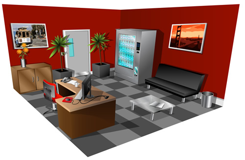
Above: Concept images of our Lab and Executive level themes. These were invaluable in deciding the overall direction of each theme and helped ensure each had a distinct identity.
Even though we had moved into 3D art we wanted to ensure Paul’s distinct art style was carried over without loss. Paul and our 3D artist Marc have done an amazing job of working together to ensure Paul’s 2D concepts are recreated faithfully in 3D. Paul is able to apply his style to the textures used to ensure we hit the right look.
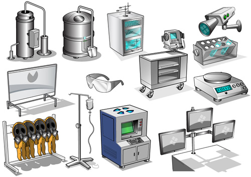
Above: Examples of concept art for the Lab theme. Paul creates these and Marc creates models based on each asset, scaling them as appropriate. Paul then works with Marc to create textures.
Our overall ethos for the Flame Over world was to create something that felt like a toy town, with lots of tiny details even in such a dinky environment. Our room designs support that, and feature an insane level of detail. We’ve certainly not made life easy for ourselves, but that means our world is incredibly rich and varied, certainly in comparison to similar games in the genre.
Needless to say, we have an exceedingly high level of variation. Our estimated final room count across the game’s 16 levels is 1200+ rooms and corridors, giving us near infinite variation possibilities.
Above: An example of 3D assets used to create a room for our Lab theme. Note these aren’t lit to final standard.
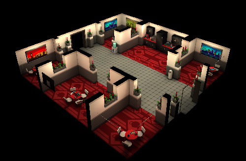
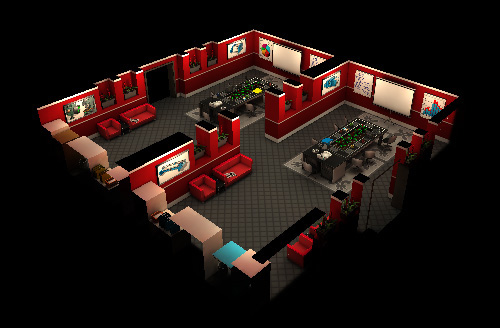
Above: An array of smaller room types used in our Executive theme. From top to bottom: kitchen, boardroom. There are MANY variations of each room in all layouts and sizes.
So, that’s how we’ve arrived at the look of our environments, but what about Flame Over’s player character, Blaze Carruthers?
I also wanted to establish a look for our main character right from the off, as I felt this would inform every other aspect of the game. Getting the character’s proportions nailed down would help us build a world that fit people of that size and his appearance would set the overall tone for the game.
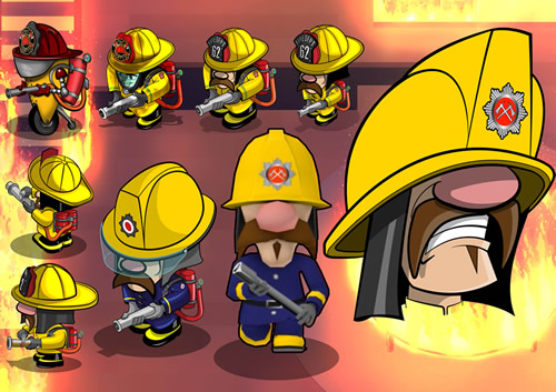
Above: Some early concept images of Blaze, with the final face on the right and the 3D version at centre.
For some reason I can’t really guess at, right away I was determined that he should have a large nose and larger moustache and that these would be his dominant facial characteristics. Maybe because a big nose is a good direction indicator in a top down world? I don’t know… Anyhow Paul produced some concepts and eventually we got to the final Blaze Carruthers design you can see in the image below.
OK, that’s all for now I think! ^^ Come back next week to find out even more about Flame Over.
Cheers for now!
Al
Share this post


We Want to Hear From You!